CSS to SCSS Converter - Convert CSS to SCSS Online
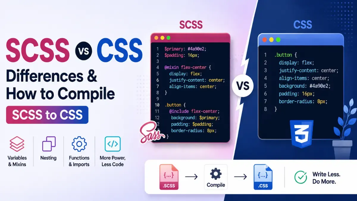
Calcon's free CSS to SCSS Converter turns plain CSS into clean, properly nested SCSS right in your browser — no signup, no file upload, and nothing ever sent to a server. It does far more than swap the file extension: it intelligently nests child selectors under their parents, folds @media queries into the selectors they modify, rewrites pseudo-classes such as .btn:hover into .btn { &:hover { … } }, and can extract repeated colors and values into reusable $variables. Paste your CSS and get production-ready SCSS instantly.
What Is a CSS to SCSS Converter?
SCSS (Sassy CSS) is a superset of CSS, which means every valid CSS file is already valid SCSS. So the value of converting CSS to SCSS isn't in making the code work— it's in giving it structure. A good CSS to SCSS converter reads the relationships hidden inside your flat stylesheet — which rules are descendants of which, which states belong to the same element — and rebuilds them as nested, DRY SCSS you'd otherwise have to write by hand. The result is a stylesheet that's easier to read, maintain, and theme, without changing a single pixel of how your site renders.
How to Convert CSS to SCSS Online
- Paste your CSS into the input box, or upload a
.cssfile. - Choose your options — selector nesting,
@medianesting, the&parent selector for pseudo-classes and modifiers, variable extraction, and indent size (2 spaces, 4 spaces, or tabs). - Copy the generated SCSS or download it as a
.scssfile. Conversion runs live as you type — there's no "convert" button to wait on.
What the Converter Does
This isn't a find-and-replace renamer. Each transformation mirrors how a developer would hand-write idiomatic SCSS:
- Smart selector nesting. Descendant and child selectors like
.card .titleand.card > .bodyare collapsed into a single nested block, parsed from a real selector AST rather than fragile string matching. - Media-query nesting. An
@mediarule that targets.cardis folded directly inside the.cardblock, so your responsive styles live right beside the component they affect. - Parent selector (
&). States and modifiers such as.btn:hoverand.btn.activebecome&:hoverand&.activenested under.btn— no duplicated selectors. - Variable extraction. Optionally pull repeated colors and values into named
$variablesat the top of the file, so a theme change is a one-line edit. - Configurable formatting.Pick 2-space, 4-space, or tab indentation to match your project's style guide or
.editorconfig. - 100% private and browser-based. Your CSS never leaves your device — the whole conversion runs locally in your browser.
CSS vs SCSS: What's the Difference?
CSS is the language browsers actually read. SCSS is a preprocessor syntax that compiles down to CSS, adding developer conveniences that plain CSS lacks — nesting, variables, mixins, functions, and partials. Because SCSS is a strict superset, converting CSS to SCSS is lossless and reversible: the compiled output is identical to the CSS you started with. You write less repetitive code, and the build step hands the browser the same result.
Why Convert CSS to SCSS?
Flat CSS files grow unwieldy as a project scales — the same colors are pasted in dozens of places, and related rules drift apart across hundreds of lines. Converting CSS to SCSS is the first step in modernizing a legacy stylesheet into a maintainable Sass workflow: nesting groups related rules together, variables centralize your design tokens, and the &selector keeps states tidy. Whether you're migrating an old project, learning Sass, or just cleaning up exported or minified CSS, this converter gives you a clean, idiomatic SCSS starting point in seconds.
Frequently Asked Questions
Isn't SCSS just valid CSS already? Why convert?
SCSS is a superset of CSS — plain CSS is already valid SCSS. The value of converting isn't syntax validity, it's the transformation quality: collapsing flat selectors into proper nesting, merging @media blocks into the selectors they target, and replacing repeated color values with named $variables. A good converter makes your SCSS idiomatic and maintainable, not just a renamed file.
Does this run in my browser? Is my CSS uploaded anywhere?
Everything runs 100% in your browser. Your CSS is never sent to any server. The conversion engine is pure JavaScript that executes locally — you can even disconnect from the internet and it still works.
How does @media query nesting work?
When "Nest @media into selectors" is on (the default), the converter finds every rule inside a @media block and merges it into the matching selector in the main tree. For example, a top-level .card {} and a @media (max-width: 600px) { .card {} } become a single .card { color: red; @media (max-width: 600px) { color: blue; } } block — which is the idiomatic SCSS style.
What does the & symbol do in the output SCSS?
In SCSS, & is the parent-selector reference. When "Use & for :pseudo-classes" is on, .btn:hover becomes .btn { &:hover { … } }. The & expands to the full selector at compile time, so the generated CSS is identical to the original. It keeps related states grouped under their base selector.
How does variable extraction work?
Enable "Extract repeated colors as $variables" and set a minimum-repeat threshold (default 2). The converter scans all declarations for colour values — hex codes, rgb(), hsl(), and named colours — and any value that appears at or above the threshold becomes a numbered $color-N variable. Variables are emitted at the top of the output and substituted everywhere.
Will converting change how my styles actually behave?
No. The converted SCSS compiles back to functionally equivalent CSS. Nesting in SCSS is just syntactic sugar — it expands to the same flat selectors the browser sees. If you keep the same declarations and specificity, your page will look exactly the same.
Can I paste CSS copied from inside <style> tags?
Yes — just paste the CSS rules themselves without the surrounding <style> and </style> tags. The converter expects raw CSS: selectors, declarations, @media blocks, and at-rules.
What happens to @keyframes, @font-face, and @import?
@import and @charset are placed at the very top of the SCSS output (where they must appear per spec). @keyframes and @font-face blocks are emitted verbatim — their internal structure is not modified, since nesting inside animation frames or font descriptors would be invalid.
Related Blog Posts
Related Developer Tools
Base64 Encoder / Decoder
Encode and decode Base64 instantly.
Bcrypt Hash Generator
Generate and verify bcrypt hashes in your browser.
Border Radius Generator
Generate CSS border-radius visually with live preview.
Box Shadow Generator
Generate CSS box shadows visually with live preview.
Color Palette Generator
Create harmonious color palettes from any color.
Color Picker
Pick colors and get HEX, RGB, HSL, CMYK instantly.
CSS Formatter / Beautifier
Format and beautify CSS code instantly.
CSS Gradient Generator
Generate linear, radial, and conic CSS gradients visually.
CSS Minifier
Minify CSS code instantly in browser.
HEX to RGBA Converter
Convert HEX colors to RGB/RGBA instantly.

Get new tools & guides
Occasional updates, no spam.